
White cabinets and granite countertops are one of the most popular combinations in kitchen design — and for good reason. The pairing is timeless, broadly appealing, and works across styles from farmhouse to modern. But it also puts real pressure on the backsplash. With two already-prominent surfaces in the room, the backsplash either ties the whole design together or creates friction.
These backsplash ideas for white cabinets and granite countertops go beyond a list of pretty tiles. They start with a design framework grounded in what your specific granite is actually doing — because granite is rarely neutral, and the right backsplash depends on reading it correctly before you ever set foot in a tile showroom.
How to Choose a Backsplash for White Cabinets and Granite Countertops
Most homeowners choose a backsplash in isolation — on a screen, in a showroom, or from a magazine spread. The result is a tile that looked perfect in photos but fights with the actual granite installed in the kitchen. Two principles fix this.
Step 1 — Read the Undertones in Your Granite
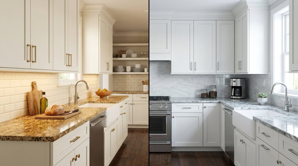
Granite is not neutral. Even slabs that photograph as simply “gray” or “black” typically carry secondary colors: warm gold flecks, threads of rust, cool blue-gray veining, or earthy green. These undertones are the real design variable. A backsplash that harmonizes with those undertones creates a kitchen that feels deliberate and cohesive; one that clashes with them will look “off” no matter how beautiful the tile is on its own.
To read your granite’s undertones, look at it in natural daylight — not under a kitchen’s artificial lighting. Hold paint chips or tile samples against it and note which ones feel calm and which create visual tension. Warm undertones (gold, brown, rust) pair beautifully with warm neutrals, creams, and terracotta-adjacent tones. Cool undertones (blue-gray, silver, green) work well with crisp whites, cool grays, and blue-green color families.
Step 2 — Decide Whether the Backsplash or the Countertop Should Lead
Your kitchen’s backsplash and countertop don’t have to compete — but one should lead. If your granite has bold movement (dramatic veining, high contrast between its mineral colors), a quieter backsplash gives it space to breathe. Marble-look subway tile in a matching neutral, or a simple large-format slab, lets the granite remain the star. If your granite is more uniform and subtle — a consistent speckle without strong veining — the backsplash is your opportunity to introduce the visual interest the countertop isn’t providing. That’s when bold color, texture, or pattern makes the most design sense.
The Best Backsplash Materials for This Combination
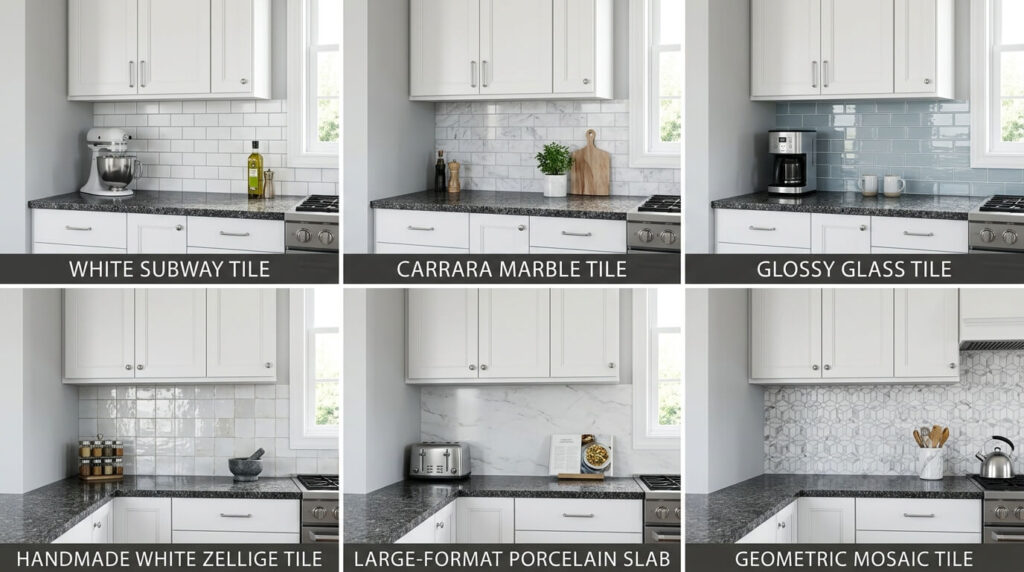
Subway Tile
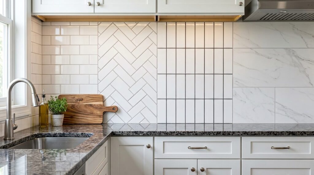
The most used backsplash material in kitchens with white cabinets, and for good reason: it’s versatile, available in every price range, and works in virtually every kitchen style. The classic 3×6-inch format in white ceramic remains a safe, timeless choice — but subway tile’s real design power is in how you lay it. A traditional brick offset reads as classic or farmhouse. A stacked vertical bond pattern reads modern and elongated. A herringbone arrangement adds dynamism without introducing color.
The upgrade path runs from basic ceramic to glass subway (more reflective, better in darker kitchens) to marble subway (particularly Calacatta or Carrara, which echo granite’s veining language beautifully). Grout color here matters more than tile color — see the grout section below.
Marble (Natural and Look-alike)
Marble and granite coexist very naturally — both are stone, both carry veining, and their textures create a layered richness that feels genuinely high-end. White Carrara or Calacatta marble backsplash tile with gray veining is particularly effective against white cabinets because the veining provides subtle contrast without introducing a competing color.
For homeowners who want the marble look with easier maintenance and a lower price point, high-quality porcelain marble-look tile now replicates the real material with impressive accuracy. Large-format marble-look porcelain (12×24 or larger) installed with minimal grout lines creates a slab effect that’s especially striking in kitchens with bolder-veined granite.
Glass Tile
Glass backsplash tile does something no other material can: it reflects light rather than absorbing it, which amplifies natural light and makes smaller kitchens feel noticeably larger. In a kitchen with white cabinets and medium-toned granite, a glossy glass tile backsplash in soft gray, pale blue, or cream can brighten the entire space.
Glass is also available as mosaic, which makes it easy to introduce multiple colors from your granite’s palette in a single backsplash surface. The practical tradeoff: glass shows fingerprints and grease more than ceramic or stone, so it requires more frequent wiping in a heavily used kitchen.
Zellige and Handmade Ceramic
Zellige — a Moroccan-origin handmade clay tile with an irregular glaze — has become one of the most design-forward backsplash choices available. Unlike machine-cut tile, each zellige piece is slightly different in color and surface, which means the installed wall has natural variation, catches light at different angles, and has a warmth that no uniform tile can replicate.
Against the precision of white cabinetry and the polished depth of granite, zellige introduces a third texture layer that bridges the two surfaces. It works particularly well in off-white, cream, or soft sage colorways where the variation reads as warmth rather than inconsistency. It costs more than standard ceramic (typically $15–$40 per square foot) but consistently reads as a premium finish.
Stone Slab or Large-Format Porcelain
Running the same material from your countertop up the wall as a slab backsplash creates the most seamless, unified look possible. This approach works best when the granite slab has enough visual interest — veining, movement — to carry a full wall surface without becoming monotonous.
For those who want the slab look without matching the exact granite, large-format porcelain or quartz slabs with minimal grout lines achieve nearly the same effect. The result is a kitchen that feels expansive and architectural, rather than tile-dependent. This is the highest-cost option but also among the most durable.
Mosaic Tile
Mosaic tile — combining shapes, colors, and sometimes materials in a single sheet installation — works well when the granite is fairly simple and the designer wants the backsplash to function as a focal point. A glass-and-stone mosaic that picks up two or three colors already present in the granite countertop creates visual cohesion while giving the backsplash its own identity.
For busy kitchens, consider where the mosaic will sit: a full backsplash in a complex mosaic can feel overwhelming, but the same mosaic used only behind the range as an accent panel against simpler tile elsewhere hits the balance between expression and restraint.
White-on-White (The Case for Monochromatic)
The most common worry about white tile behind white cabinets is that it will disappear or look clinical. Done well, the opposite is true. A white backsplash with texture — handmade glaze, three-dimensional surface relief, or a herringbone pattern — creates subtle depth that reads as intentional rather than blank. The key is introducing contrast through grout (a warm gray or greige grout on white tile creates quiet definition) and through texture rather than color.
Gray and Greige
Gray and greige backsplashes are the most reliable neutral choice for this combination because they respond naturally to granite’s typical secondary tones. A soft greige tile behind white cabinets and a warm-toned granite like Santa Cecilia or Venetian Gold creates a calm, unified palette where everything feels of a piece. For cooler granites — White Ice, Steel Gray — a blue-gray tile rather than a warm gray prevents the palette from feeling disconnected.
Navy, Cobalt, and Deep Blue
A deep blue backsplash is the highest-impact color move in this pairing, and it works especially well when the granite carries warm undertones. The contrast between a rich navy and warm-flecked granite is intentional and sophisticated rather than harsh, because the warmth in the stone prevents the blue from reading cold. White cabinets here act as the mediator — bright and clean between the two surfaces. The practical rule: commit to the color rather than hedging with a washed-out version of it, which can look uncertain rather than deliberate.
Sage and Forest Green
Green has become one of the most prominent kitchen backsplash directions — and it suits granite kitchens particularly well because most granite carries at least trace amounts of green or earthy mineral tones. Sage works in softer, more traditional kitchens; a deeper forest or hunter green reads modern and dramatic. Either direction pairs well with the natural quality of stone countertops.
Black (High-Contrast Drama)
For kitchens where the goal is drama and contemporary edge, a black or dark charcoal backsplash against white cabinets creates the highest possible contrast. This works best with lighter granites (White Ice, Colonial White, Bianco Antico) where the countertop won’t compete with the dark background. With dark granites like Black Pearl, an all-dark backsplash can make the kitchen feel heavy; a dark backsplash with metallic or reflective finish (dark glass tile, for example) adds sophistication without overwhelming.
Backsplash Ideas by Granite Color
This is the section most design guides skip — specific pairings by granite color. Granite isn’t interchangeable, and the best backsplash for one slab can look wrong behind another.
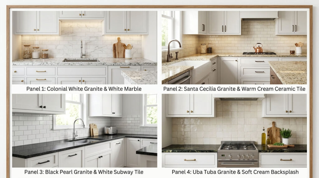
White Ice and Colonial White Granite
These cooler, light-toned granites with fine silver and gray speckling pair exceptionally well with: cool-toned white subway tile with light gray grout, soft blue-gray glass tile, or a large-format marble-look porcelain. Bold colors like navy or deep green also work well because the light granite prevents the kitchen from feeling dark.
Santa Cecilia and Venetian Gold Granite
These warm-toned granites with gold, cream, and burgundy speckling are among the most popular in residential kitchens. Best backsplash directions: warm white or cream subway tile, travertine-look porcelain, soft gold or earthy mosaic, or a classic white marble with gold veining (Calacatta Gold). Avoid cool gray tones, which will fight the warmth in the granite.
Black Pearl and Absolute Black Granite
These dramatic dark granites with silver and gray mineral patterns work well with: white subway tile (timeless contrast), light gray or cream tile, or a warm-toned marble subway that softens the contrast. A white backsplash with black grout creates a graphic, modern statement. Avoid mid-tone gray — it can make the granite and backsplash look muddied.
Uba Tuba and Tropical Green Granite
These dark green-black granites with gold and green mineral content benefit from backsplashes that echo their warmth: cream, warm white, soft gold glass tile, or earthy mosaic. A bright white backsplash with white grout works beautifully here, letting the dark granite’s richness stand without competition.
Grout Color, Tile Size, and Other Details That Make or Break the Design
Color
This affects the finished backsplash at least as much as tile selection, yet most homeowners choose it as an afterthought. The principle is simple: contrasting grout (dark grout on light tile, or white grout on dark tile) emphasizes the tile’s pattern and shape, creating a more graphic look. Matching grout (white grout on white tile) creates a seamless surface where texture matters more than pattern. For most white kitchen backsplashes, a warm light gray or greige grout reads as more sophisticated and hides grease better than bright white grout, which requires more maintenance to keep looking clean.
Tile Format and Kitchen Scale
Tile size should be proportional to the kitchen’s visual scale. Large-format tiles (12×24 or larger) reduce visual clutter and are a strong choice in open-plan or larger kitchens. Standard subway (3×6) works well at any scale. Small-format tiles — penny tile, 2×2 mosaic — add texture and detail, but in large quantities can make a smaller kitchen feel busier. If you’re using a bold pattern, larger individual tiles create a clearer impression of that pattern than many small tiles.
Full-Height vs. Standard Backsplash Height
The standard backsplash runs from countertop to the bottom of upper cabinets — roughly 18 inches. Full-height backsplashes (counter to ceiling, or ceiling to the top of upper cabinets) create a more dramatic, architectural statement and work especially well with slab backsplashes, bold tile colors, or when the kitchen has high ceilings worth emphasizing. The cost is proportionally higher, but the impact-per-dollar ratio is often favorable compared to other renovation choices.
Budget Guide: What Each Backsplash Material Costs
| Material | Approx. Material Cost (per sq ft) | Notes |
|---|---|---|
| Ceramic subway tile | $2–$8 | Most affordable; wide style range |
| Porcelain tile | $5–$15 | Durable; great marble and stone looks |
| Glass tile | $10–$25 | Reflective; requires careful installation |
| Natural marble tile | $15–$40+ | Timeless; requires sealing |
| Zellige / handmade ceramic | $15–$45 | Premium look; high variation |
| Large-format porcelain slab | $20–$60+ | Near-slab look; fewer grout lines |
| Natural stone slab | $40–$100+ | Most seamless; highest cost |
FAQ Backsplash Ideas for White Cabinets And Granite Countertops
What color backsplash goes best with white cabinets and granite countertops?
There’s no single best color — it depends on your granite’s undertones. Warm-toned granites (gold, cream, rust) pair well with warm whites, creams, and soft earthy tones. Cool-toned granites (gray, silver, blue) work well with crisp whites, cool grays, and blue-adjacent colors. When in doubt, a soft gray or warm white subway tile is the most universally compatible choice.
Should the backsplash match the granite countertop?
It doesn’t need to match, but it should respond to it. The backsplash should pick up at least one undertone or color already present in the granite — this creates cohesion without being matchy-matchy. Extending your granite up the wall as a slab backsplash creates the most unified look if you want an actual match.
What is the most timeless backsplash for a white kitchen?
White subway tile in a classic brick offset or herringbone pattern with light gray grout. It’s been popular for over a century because it’s clean, neutral, and works with virtually every design direction. Marble subway tile is the premium version of the same idea and ages equally well.
What backsplash goes with white cabinets and black granite?
White subway tile with black grout creates a graphic, modern look. Classic white marble tile creates a more elegant, softer contrast. A warm cream or off-white tile softens the darkness of the granite. Avoid mid-tone gray, which tends to make both surfaces look muddied.
Can you do a white backsplash with white cabinets without it looking boring?
Yes — through texture and layering rather than color contrast. A white zellige, three-dimensional relief tile, or marble subway with visible veining creates enough visual variation to keep an all-white palette from reading flat. Contrasting grout (light gray rather than white) helps define the tile pattern without introducing color.
What grout color should I use with a white tile backsplash?
For maintenance ease and a sophisticated look, warm light gray or greige grout outperforms bright white grout — it hides grease better and creates subtle definition that white grout doesn’t. For a deliberately graphic look (herringbone or subway pattern you want to emphasize), a medium gray or charcoal grout makes the pattern more prominent.
Is subway tile still in style for kitchen backsplashes?
Yes — subway tile is classic rather than trendy, which is different from being “in” or “out” of style. What has evolved is how designers use it: vertical stacking, herringbone layouts, oversized formats (4×12 or larger), and materials upgrades like handmade ceramic or marble keep it feeling current. The 3×6 horizontal brick offset in white ceramic has been popular for over 100 years and shows no sign of being replaced.
What backsplash makes a small kitchen look bigger?
Glossy tile (glass or polished ceramic) reflects light and visually expands the space. Large-format tile reduces the number of grout lines, creating a less fragmented surface that reads as larger. Light-colored tile with matching or near-matching grout creates a seamless look that doesn’t visually chop up the wall.
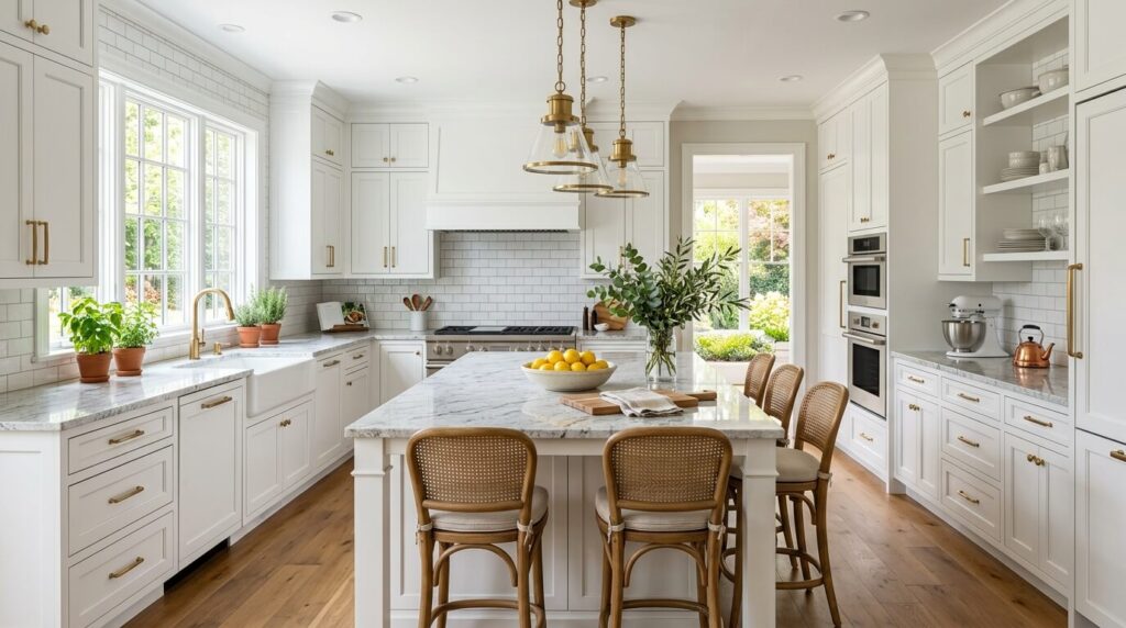
The right backsplash for white cabinets and granite countertops isn’t the prettiest tile in the showroom — it’s the tile that listens to your granite first. Read the undertones in your stone, decide whether you want your backsplash to lead or support, and then use material, color, and pattern to complete what the countertop started.
Whether you go with the enduring simplicity of white subway tile, the layered warmth of handmade zellige, or the architectural drama of a full-height slab, the options in this guide cover every style direction and budget. The key is making your choice informed rather than impulsive.